200 lines
7.5 KiB
Markdown
200 lines
7.5 KiB
Markdown
|
||
## next-data-select --当选项过多时,使用下拉菜单展示并选择内容
|
||
|
||
> 遇到问题或有建议可以加入QQ群(<font color=#f00>455948571</font>)反馈
|
||
> 如果觉得组件不错,<font color=#f00>给五星鼓励鼓励</font>咯!
|
||
|
||
|
||
## 注意
|
||
|
||
### 作者不介意你对组件源码进行改造使用,为了开源更加高效,谢谢你的配合;为了节省不必要的沟通浪费,以下情况请不要再反馈给作者,请自行解决;
|
||
### 在这感各位的理解,我支持开源,但是作者时间有限;谢谢各位的配合;在这里期望我写的小小插件能为你提供便捷;
|
||
|
||
> 1.如果你对源码进行了修改使用,请不需要对作者做任何的反馈,作者确实没有空陪你做技术分析解答;
|
||
> 2.如果你引入插件,连插件是否有正常被uniapp框架识别解析都不清楚,请你换个插件使用;
|
||
> 3.如果你引入插件,针对自己项目进行功能改造的,请自行仔细阅读源码并了解其原理,自行改造;这里作者不愿意浪费过多时间进行技术解答;
|
||
> 4.理论上作者不再解决由于本地开发环境问题所导致的插件使用问题,请自行到uniapp官网学习解决;
|
||
|
||
## 使用
|
||
|
||
>[从uniapp插件市场导入](https://ext.dcloud.net.cn/plugin?name=next-data-select)
|
||
|
||
### vue3 + ts 使用
|
||
|
||
```ts
|
||
<template>
|
||
<view style="padding:15px;">
|
||
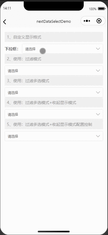
<view style="font-size: 14px;color: #999;padding: 8px;background-color: #f0f0f0;margin-bottom: 6px"><text>1、自定义显示格式</text></view>
|
||
<next-data-select label="下拉框" @change="onchange" format="{text}-{value}-{lable}" :options="options" v-model="testModel" />
|
||
<view style="font-size: 14px;color: #999;padding: 8px;background-color: #f0f0f0;margin-bottom: 6px"><text>2、使用:过滤模式</text></view>
|
||
<next-data-select @change="onchange" :filterable="true" :options="options" v-model="testModel" />
|
||
<view style="font-size: 14px;color: #999;padding: 8px;background-color: #f0f0f0;margin-bottom: 6px"><text>3、使用:过滤多选模式</text></view>
|
||
<next-data-select @change="onchange" :filterable="true" :multiple="true" :options="options" v-model="testModel" />
|
||
<view style="font-size: 14px;color: #999;padding: 8px;background-color: #f0f0f0;margin-bottom: 6px"><text>4、使用:过滤多选模式+收起显示模式</text></view>
|
||
<next-data-select @change="onchange" :collapseTags="true" :filterable="true" :multiple="true" :options="options" v-model="testModel" />
|
||
<view style="font-size: 14px;color: #999;padding: 8px;background-color: #f0f0f0;margin-bottom: 6px"><text>5、使用:过滤多选模式+收起显示模式配置控制</text></view>
|
||
<next-data-select @change="onchange" :collapseTags="true" :collapseTagsNum="2" :filterable="true" :multiple="true" :options="options" v-model="testModel" />
|
||
</view>
|
||
</template>
|
||
<script setup lang="ts">
|
||
import {ref, unref} from 'vue';
|
||
const testModel = ref();
|
||
const options = ref([
|
||
{
|
||
text: '测试1',
|
||
value: 1,
|
||
lable: '选项1'
|
||
},
|
||
{
|
||
text: '测试2',
|
||
value: 2,
|
||
disabled: true,
|
||
lable: '选项2'
|
||
},
|
||
{
|
||
text: '测试3',
|
||
value: 3,
|
||
lable: '选项3'
|
||
},
|
||
{
|
||
text: '测试4',
|
||
value: 4,
|
||
lable: '选项4'
|
||
},
|
||
{
|
||
text: '测试5',
|
||
value: 5,
|
||
lable: '选项5'
|
||
},
|
||
{
|
||
text: '测试6',
|
||
value: 6,
|
||
lable: '选项6'
|
||
},
|
||
{
|
||
text: '测试7',
|
||
value: 7,
|
||
lable: '选项7'
|
||
},
|
||
{
|
||
text: '测试8',
|
||
value: 8,
|
||
lable: '选项8'
|
||
},
|
||
]);
|
||
function onchange() {
|
||
console.log(1111111, unref(testModel))
|
||
}
|
||
</script>
|
||
<style lang="scss">
|
||
</style>
|
||
|
||
```
|
||
|
||
### vue2 使用
|
||
```js
|
||
<template>
|
||
<view style="padding:15px;">
|
||
<view style="font-size: 14px;color: #999;padding: 8px;background-color: #f0f0f0;margin-bottom: 6px"><text>1、自定义显示格式</text></view>
|
||
<next-data-select label="下拉框" @change="onchange" format="{text}-{value}-{lable}" :options="options" v-model="testModel" />
|
||
<view style="font-size: 14px;color: #999;padding: 8px;background-color: #f0f0f0;margin-bottom: 6px"><text>2、使用:过滤模式</text></view>
|
||
<next-data-select @change="onchange" :filterable="true" :options="options" v-model="testModel" />
|
||
<view style="font-size: 14px;color: #999;padding: 8px;background-color: #f0f0f0;margin-bottom: 6px"><text>3、使用:过滤多选模式</text></view>
|
||
<next-data-select @change="onchange" :filterable="true" :multiple="true" :options="options" v-model="testModel" />
|
||
<view style="font-size: 14px;color: #999;padding: 8px;background-color: #f0f0f0;margin-bottom: 6px"><text>4、使用:过滤多选模式+收起显示模式</text></view>
|
||
<next-data-select @change="onchange" :collapseTags="true" :filterable="true" :multiple="true" :options="options" v-model="testModel" />
|
||
<view style="font-size: 14px;color: #999;padding: 8px;background-color: #f0f0f0;margin-bottom: 6px"><text>5、使用:过滤多选模式+收起显示模式配置控制</text></view>
|
||
<next-data-select @change="onchange" :collapseTags="true" :collapseTagsNum="2" :filterable="true" :multiple="true" :options="options" v-model="testModel" />
|
||
</view>
|
||
</template>
|
||
<script setup lang="ts">
|
||
export default {
|
||
data() {
|
||
options: [
|
||
{
|
||
text: '测试1',
|
||
value: 1,
|
||
lable: '选项1'
|
||
},
|
||
{
|
||
text: '测试2',
|
||
value: 2,
|
||
disabled: true,
|
||
lable: '选项2'
|
||
},
|
||
{
|
||
text: '测试3',
|
||
value: 3,
|
||
lable: '选项3'
|
||
},
|
||
{
|
||
text: '测试4',
|
||
value: 4,
|
||
lable: '选项4'
|
||
},
|
||
{
|
||
text: '测试5',
|
||
value: 5,
|
||
lable: '选项5'
|
||
},
|
||
{
|
||
text: '测试6',
|
||
value: 6,
|
||
lable: '选项6'
|
||
},
|
||
{
|
||
text: '测试7',
|
||
value: 7,
|
||
lable: '选项7'
|
||
},
|
||
{
|
||
text: '测试8',
|
||
value: 8,
|
||
lable: '选项8'
|
||
},
|
||
],
|
||
testModel: ''
|
||
},
|
||
methods: {
|
||
onchange() {
|
||
console.log(1111111, this.testModel)
|
||
}
|
||
}
|
||
}
|
||
</script>
|
||
```
|
||
|
||
|
||
### 预览
|
||
###
|
||
***
|
||
|
||
| 功能预览 |
|
||
| :---------------------------------------------------------------------------: |
|
||
|  |
|
||
|
||
|
||
|
||
## API
|
||
|
||
### next-data-select Props
|
||
|
||
| 属性名 | 类型 | 默认值 | 说明 |
|
||
| - | - | - | - |
|
||
| v-model | String、Array、Number |- | 选中项绑定值 |
|
||
| multiple | Boolean | false | 是否多选 |
|
||
| disabled | Boolean | false | 是否禁用 |
|
||
| optionsLabelKey | String | "text" | 作为 label 唯一标识的键名 |
|
||
| optionsValueKey | String | "value" | 作为 value 唯一标识的键名 |
|
||
| optionsDisabledKey | String | "disabled" | 作为 disabled 唯一标识的键名 |
|
||
| collapseTags | Boolean | false | 多选时是否将选中值按文字的形式展示|
|
||
| collapseTagsNum |Number | 1 | 多选时选中值按文字的形式展示的数量|
|
||
| options | Array |- | 下拉列表本地数据 |
|
||
| label | String | - | 左侧标题
|
||
| placeholder | String | "请选择" | 输入框的提示文字|
|
||
| emptyTips | String |"无选项" | 无选项提示|
|
||
| clear | Boolean | true | 是否清空|
|
||
| themeColor | String | "#f9ae3d" | 主体颜色|
|
||
| format | String | - | 格式化输出 用法 field="_id as value, version as text, uni_platform as label" format="{label} - {text}"|
|
||
|